A Logo Is Born
How My Current Logo Was Designed
I don’t get to play with Adobe Illustrator half as much as I used to, which is a shame as I’ve always loved tweaking my vectors, so to speak! My old website gave me an opportunity to play around with this great software once again and the first port of call had to be a nice shiny new logo!
 1: My old logos have always been based around my initials so I didn’t see any reason to change that. First things first, I looked at existing fonts and came across a lovely modern sans serif display face called Spaceman.
I was specifically drawn to the A and being all lowercase seemed aesthetically pleasing.
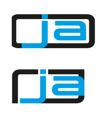 2: From here, I looked at encasing the initials inside some form of round-corned rectangle or badge, using the same stroke weight as the letterforms themselves.
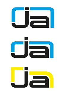 3: I also played around with the dot of the J.
This was when I started to feel I needed to start customising the font.
Firstly, I curved the J.
Next, I pushed it upwards, effectively removing the descender.
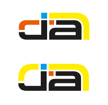
 4: The J was now too tall so I matched the J and A’s x-heights, creating a more compact and balanced form. This started to take me down some interesting avenues.
I particularly liked the idea of echoing the dot of the J, which by now had also been converted to a square.
By this stage I was already thinking about possible colour schemes, too.
I quite liked the bold, almost-primary colours I was selecting alongside the starkness of the black.
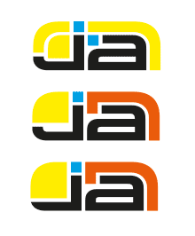
 5: Something still wasn’t structurally right.
There were too many curves being introduced.
In an effort to ground the design I straightened the base of the J and A.
Now I felt I was really getting somewhere!
 6: Trying to simplify things wasn’t quite working for me in any of these examples.
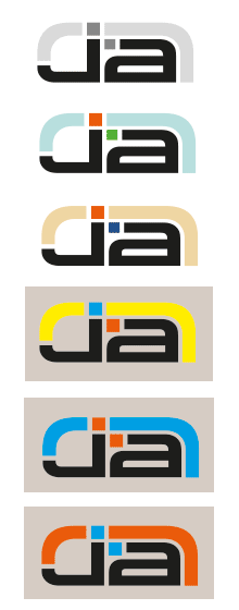 7: With my final design pretty much nailed, I turned the logo monochrome before experimenting with a number of other colourways.
The final three designs also lead me to make the square ‘dot’ motif consistent in size, rather than being dictated by the stroke weight.
A larger dot on the A actually gave it an almost serif-like accent, which worked quite nicely to tie the two letters together.
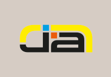 8: I returned to my original four-colour design.
An almost ‘rusty’ red and ‘azure’ blue seemed to balance well with the warm yellow.
I feel it offers some warmth and a suggestion of fun, without coming across too corporate.
I suppose I could have gone down the route of Pantone swatches etc, but as this logo was purely created for a website and I have no intention to start creating printed stationery and suchlike I really didn’t see why that mattered!
These are the hexadecimal colours I’ve worked with:
- Yellow: #ffee00
- Blue: #009fe4
- Red: #eb5b0b
- Black: #000000
Take the coloured elements away and the logo still works on some level thanks to the strongest black areas. The logo is also bold enough to work in single and two-colour forms.
Overall, I’m very happy with the finished design!
A Stage Further
9: I also wanted to work with an extended version. The first stage was to revisit the Spaceman font and convert it into editable vector outlines.
 10: Next step was to apply the tweaks to the J and A as already discussed. A few more tweaks were needed to individual letters, particularly the median line as the O wasn’t lining up.
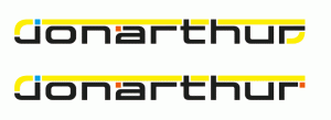
 11: Once again I looked at the yellow border and how that could work. Plus, in an effort to simplify things, I considered reworking the last letter R to echo this border.
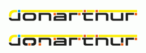 13: Applying the square device to every letter was an interesting option.
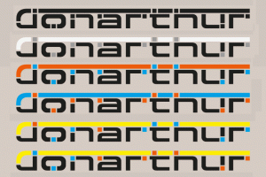 14: Several colourways were also experimented with.
 15: I wanted people to help realise it was ‘jon’ and ‘arthur’, not ‘jonarthur’, therefore a simpler approach seemed best with regards to colour.
 16: After much deliberation, I felt the extra squares overcomplicated what is essentially quite a minimal aesthetic. A simpler design was therefore decided upon, leaving the yellow border purely for the JA initials ‘badge’ instead.
A Winning Combo
 17: Together, I feel the two designs work quite nicely. The full name underpins and helps to echo the striking initials.
 18: For my website, a final optional flourish was to add a very simple sheen to help create an illusion of depth.
 19: For my old (2013-2016) website’s header, I also echoed the shape of the logo with its white background.
This was all done using CSS3 alpha shadows and border radius properties, so those without a modern browser get a more straightforward versions without all the bells and whistles.
I really hope you like what I’ve done and some of the thought processes behind it all!
Into 2017
 20: For my updated website I felt a change of colour scheme was definitely in order. I therefore did away with the bright colours and reverted to my favourite blues, toning down the entire logo.
Several years on from its inception I’m still quite happy with my logo. It serves its purpose quite well.






Amazing stuff!
Thanks Joe, glad you like it! 🙂